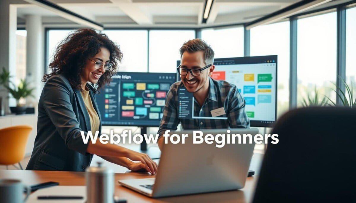
Ready to prove you can launch a polished site in days, not months? This guide shows how the visual tools of webflow for beginners let you craft a professional online presence without writing code.
You will learn core design principles that keep pages clean and user-focused.
These steps help you manage assets and shape a brand that looks and works like a pro.
The walkthrough also covers how to add smooth interactions that make your pages feel alive.
We keep explanations practical so you can move from idea to live site with confidence.
Key Takeaways
- Visual tools replace code: build a responsive site fast.
- Design basics matter: layout, typography, and color drive results.
- Interactions add polish: simple animations improve engagement.
- Asset management: keep images and symbols organized for speed.
- Practical path: step-by-step practice helps you launch with confidence.
Preparing Your Website Strategy
Start by mapping a simple strategy that ties each page to a clear business outcome. This keeps your work focused and measurable as you move from plan to launch.
Defining Goals and CTAs
Pick one primary goal and a single CTA for that goal. Share it with your team so decisions stay aligned.
Draft H1 and H2 headings in a doc before you build. That speeds content creation and reduces rework.
Organizing Brand Assets
Collect logos, color files, and typography up front. A tidy asset set smooths your design workflow.
Create a basic sitemap with Home, About, and Services pages. That structure makes navigation clear and helps content flow.
| Task | Why it matters | Who owns it |
|---|---|---|
| Primary goal & CTA | Focuses design and conversion | Project lead |
| Sitemap | Defines site pages and user paths | Content strategist |
| Brand assets | Keeps visuals consistent across every page | Designer |
| Headings draft | Speeds final content edits | Copywriter |
| Role assignment | Prevents overlap and delays | Project manager |
Getting Started with Webflow for Beginners

Create your account and log in to reach the dashboard and begin your first site. The signup process gives you immediate access to templates, pages, and the editor tools that speed setup.
During onboarding, the platform asks about your role and experience. This tailors the initial tour so you see the features that matter to your work.
Use Webflow University’s video resources to guide your learning. Short, focused videos let you learn at your own pace and revisit topics when you need a refresher.
- Once you log in, explore the site builder tools and experiment with layout and content.
- Tap community resources and tutorials to speed up problem solving and design decisions.
- If you want a quick comparison of platforms and blogging tools, see this helpful guide: best blogging platforms.
Tip: Treat your first project as a learning lab. Build one page, publish it, then iterate. That approach keeps momentum and produces a real site you can improve fast.
Selecting Your Project Foundation

Your choice between a blank canvas and a template sets the pace for every page.
Templates speed you up. They give a structured base so you can focus on customizing content and swapping placeholder text and images. When you pick a template for your webflow site, check that it includes core features like galleries, blog pages, or contact forms.
Blank projects give full control. Start blank when you need a bespoke layout or want to define the layout of every page manually. That route takes more time but yields total design freedom.
How to decide
- Choose a template to move fast and keep a consistent look across pages.
- Choose blank to build unique structures and precise interactions.
- If you are still getting started webflow, a template eases the learning curve.
| Approach | Best when | Trade-off |
|---|---|---|
| Template | Need fast launch and standard pages | Less control over unique layouts |
| Blank project | Require custom layouts and full control | More time to build each page |
| Hybrid (start template) | Customize core sections, add new pages | Requires careful cleanup of placeholder content |
Mastering the Core Design Concepts
Clear design concepts let you move from visual idea to functional page faster. These fundamentals save time and reduce rework as you build and iterate.
Designer Versus Editor Environments
The Designer is where you shape layout, styling, and complex interactions. Use it when you need full control of elements, classes, and responsive rules.
The Editor gives your team safe access to update content without altering the structure. Ask content owners to log in here to make text and image edits.
Understanding the Box Model
Master the box model to control margin, padding, and borders. This is the backbone of modern web design and fixes most layout surprises.
Think of each element as a box. Tweak spacing and the page snaps into place.
Working with Classes and Variables
Use classes and variables to keep a consistent design workflow across pages. One change to a class can update many elements at once, which helps your team move faster.
- Designer: build structure and interactions.
- Editor: update content and grant access safely.
- Classes: enforce consistent web design and styling.
By mastering these areas you gain access to the platform’s full power. The result: cleaner pages, smooth interactions, and a scalable CMS-backed site you can confidently ship.
Customizing Your Template and Branding

Start by tuning typography and images to turn a template into a true brand asset. Good type settings make text readable on every page and reduce friction for visitors.
Use the Assets panel to upload logos and real brand images. Replace placeholders so the site looks consistent and authentic.
Apply classes to headings and text blocks. A single class change can update many elements and keep your design steady during content changes.
- Typography: set font size and line height for readability.
- Assets: swap images and icons to match brand tone.
- Editor: let editors update text on the page without altering layout.
As you keep learning, managing CMS collections becomes central. Organize items so new content publishes cleanly and avoids style drift.
| Action | Benefit | Owner |
|---|---|---|
| Typography tuning | Improves reading and conversion | Designer |
| Replace assets | Makes the site feel branded | Marketing |
| Class-based styles | Keeps design consistent during content changes | Designer / Dev |
Ensuring Responsive Design Across Devices
Make sure every layout adapts so visitors get the same clear experience on phones, tablets, and desktops.
Start with practical checks that reveal layout breaks early. Preview each page in smaller viewports and fix text or image shifts before publishing.
Optimizing Layouts for Mobile and Tablet
Use the device preview icons in the Designer to confirm your site looks right on desktop, tablet, and mobile.
- Adjust Flexbox and Grid settings while you test; this is central to learning how layouts respond and what user feedback they deliver.
- Compress images and set proper formats so each page loads fast and stays crisp on small screens.
- Implement 301 redirects after structural changes to keep links working and preserve SEO value.
- Webflow supports localization on eligible plans, so you can keep your layout intact while translating content for a global audience.
- Test on real devices regularly to catch quirks that previews may miss.
| Check | Action | Benefit |
|---|---|---|
| Device preview | View desktop, tablet, mobile | Confirms page layout consistency |
| Flexbox & Grid | Tweak alignment and gaps | Improves responsive behavior |
| Image optimization | Compress and set dimensions | Speeds load time on all devices |
| Redirects | Map old URLs to new | Protects SEO and links |
Implementing Dynamic Content and Interactions
Make content management simple: set up collections so your team can publish without a designer.
Setting Up CMS Collections
Create collections for posts, team profiles, or products. Bind fields like title, image, and summary to elements on a page.
When you update an item, the linked pages reflect those changes automatically. This keeps the site current with less manual work.
Adding Motion and Triggers
Use the Interactions panel to add motion and triggers that guide attention. Keep animations purposeful so they support content instead of distracting visitors.
Watch a short video on GSAP mouse move triggers to build richer interactions. Test with your team and collect quick feedback before launch.
- Bind once: connect CMS fields to design elements to reduce repeat edits.
- Limit motion: add subtle triggers that enhance the user journey.
- Grant access: give editors CMS access to publish updates safely.
| Feature | Use case | Benefit |
|---|---|---|
| CMS Collections | Blog posts, team pages | Automatic updates across pages |
| Interactions | Scroll, hover, click triggers | Higher engagement, clearer focus |
| Designer Controls | Style and bind elements | Consistent brand and faster edits |
| Training Video | GSAP triggers tutorial | Advanced motion without guesswork |
Conclusion
Shipping your first site turns ideas into a visible outcome you can test and improve.
Follow the steps here to structure your content, set up CMS items, and make a responsive site that works on any device. This approach keeps design focused and speeds how you get started.
Keep learning with targeted resources and practice. See a curated list of the best no-code web design tools to expand your toolkit and speed future projects on the platform.
Build one page, publish, then iterate. Small, steady progress will help you launch more sites with confidence.